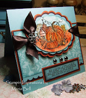
Simple Card Design
 Last night I was thinking about the design of my cards and realized that I seem to gravitate towards very busy looking designs and really haven't made a really simple card for quite some time without a lot of cutting, coloring, layering, embellishments etc., etc.
I really like the look of many of the simple card designs that I see with other stampers and decided to minimize my card design a little.
I really like the simplicity of this card and it took me less than 15 minutes to create! I love that part of it especially.
I think I'm going to make a lot more simple cards. What do you think? Should I scale down a little? I really need an opinion. If someone could comment and give me a bit of your input, it would really be helpful to me.
Card Detail:
Stamp set: Sketch It, Swirls and Blossoms
Paper: Pink Passion (may be substituted for any pink color cardstock), Old Olive, Whisper White
Ink: Pink Passion (sub for any other pink desired), Old Olive
Accessories: Off White large brad, dot grosrain ribbon
Until later. . .


2 comments:
Oh I love the background of this card. Very nice.
About simplifying your cards. Ummmmm I actually really like your busy style. That's one of the reasons I come here. :)
How about we compromise and take turns on doing simple, then busy, then simple, then busy?
The card is nice. It is not busy at all. TFS.Liann
Post a Comment