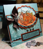
Elegant Christmas
 I made this card for Angel's (Angelosity) Challenge/Blog Candy. I really had fun making this card. I'm beginning to love making simple elegant cards. I tend to gravitate towards busy cards but lately, I've been switching back and forth from busy to simple
This card is for today's sketch #19: Click Here for the sketch. Angel will be giving a big prize on the day of her birthday which is day 31 (I think). Okay. . .I sort of messed up on the sketch because the square (primary image) suppose to be smaller. I realized that I had over matted the card and it just was too big to match the sketch exactly. I didn't want to start over so I decided to keep it. The card matches the sketch if you don't take into account the layering.
I heat embossed the images with SU gold embossing powder. In person, the images are very glittery. I love it. Simple but flashy at the same time. Yay!


9 comments:
I like them both! I love Etruscan. I think I will pull it out and use it!!
Your card is beautiful! So elegant.
They are both beautiful! I think my eye is drawn to number 2 though. :0)
I'm loving them both but I think #2 is my fav!
They are both beautiful. I like both equally so no help from me with which one I like best.I love the look of the emboosing - very elegant.
Elegant is right!!!! They are both gorgeous Maria,TFS!!!
I like them both! They are both beautiful cards, but my eye is drawn towards the second one. Amazing how twisting the square to look like a diamond makes such a difference! Very Elegant!
Beautiful card. I like them both but I like the 2nd one better. It stands out more with the square angled. JoAnn B.
They're both Beautiful and So Elegant!! I love the embossing.
Post a Comment