


Side View or Front View - Angel Christmas Cards
 I have a question. . .take a look at the two pictures of the first card. . .which view do you prefer, the front view to the right or the side angle view below. I, typically, take my pictures with the front view but the 3D effects look flat. The side angle view shows the 3D aspect of the card. On the same token, the front view capture all the details of the card which sometimes is missed with a side angle. I need your opinion, which way do you think is better?
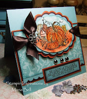
Anyway. . .it was a pain to color this image. I had stamped the image on to a gold colored cardstock rather than white therefore it was hard to get the colors to stand out. The lines of the image sort of faded away and I couldn't really give the image highlights. To add the highlights, I had to go over the image with white pencil. The colors actually stands out more with the picture than it does in person. The sentiment says Season of Peace but because of all the glitter and the position of my light source, I couldn't capture the sentiment without it being overly shiny. Here is the card at a side angle. Your opinion matters so let me know which you like better.
Card Details:
Basically the same as the second card except I colored the image using Prismacolor Pencils and very little Gamsol.
See the card details below.
 I think my light source was too close to my card. The card isn't as yellowish as the picture shows. I didn't want to retake the picture. . .oh well.


10 comments:
The side angle view shows the layers perfectly. If I had to chose, it would be this angle.
Great cards Maria.
I like the first one best. Beautiful cards!
So elegant! Great sketch, also!
the side view looks better
I love angels !
I like the front view.
Sometimes you just have to post 2 pictures to get the true effect of the card that won't show up in one angle. I think the side view shows the angel better & the full view shows the sentiment better. You did a fantastic job coloring this angel! Awesome!!! Where did you get the Egyptian Gold embossing powder?
Beautiful job, Maria!! Wow!! I think the angled shot does give more of the 3d effect of the card.:0)
I like the side angle better because it shows the highlighting better.
So beautiful! I have been looking at all your holiday cards on your blog and it makes me want to start making some!
These are both beautiful! Love the Cuttlebug background. Great sketches!!!
Post a Comment